Piketty and Saez construct some time series from census data, tax data, and national income accounts. They use census data to find the total number of tax units in a country. A tax unit might be an individual, or it might be a household. Tax data is used to find top incomes and their decomposition by source. National income accounts and their predecessors are used to convert top incomes into shares. Piketty and Saez are sensitive to issues of tax evasion and avoidance.
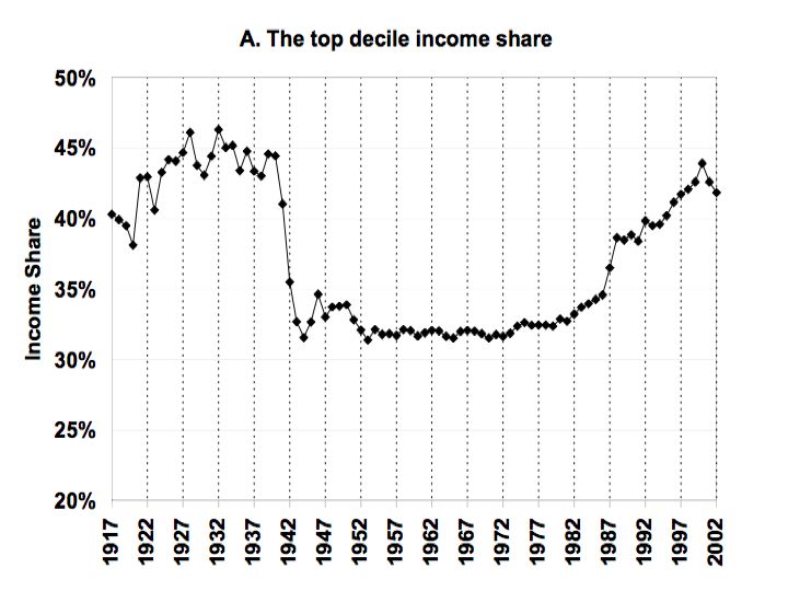
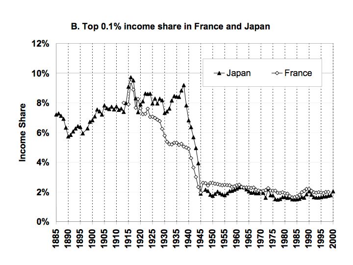
The figures below are selected results from Piketty and Saez. Rank tax units, each year for, say, the United States, by income obtained. For Figure 1, look at the upper 10% (a decile) of these tax units. The figure shows the trend in the percentage of income obtained by these tax units over almost a century. If income were distributed perfectly equal, the graph would show a straight line at 10% on the vertical axis. Since income is not equally distributed in the United States, the time series is above 10%. The graph starts at 20% to emphasize the observed fluctuations in the proportion of income obtained by the top decile. Notice that Figures 2 and 3 show international comparisons for the top one thousandth, not the top tenth.
 |
|---|
| Figure 1: Income Share Of Top Decile In United States |
 |
|---|
| Figure 2: Income Share Of Top 0.1% In U.S.A., U.K., And Canada |
 |
|---|
| Figure 3: Income Share Of Top 0.1% In Japan And France |
Piketty and Saez show that what Claudia Goldin and Robert Margo name “the great compression” in income distribution has been reversed in the United States. It has not been reversed in Japan and France, though.
Since Piketty and Saez are exploring the upper end of income distribution, they do not document the contrast between the “picket fence” and “staircase” pattern in income distribution. Since this contrast is a basic fact about the United States, I summarize it here. As above, suppose all households or individuals are ranked by annual income for each year. Divide this population into five groups, that is, into quintiles. So the poorest fifth is the first quintile, and the richest fifth is the fifth quintile. Calculate the average (mean) income of each quintile for each year.
You will find that during the post (Second World) War “golden age” (extending roughly until sometime in the 1970s), the average income of all quintiles increased roughly at the same rate. When the increase of the average income by quintile is graphed versus quintile, one obtains a picket fence pattern. On the other hand, one obtains a staircase pattern during the last third of a century or so. The average income of the first quintile seems to have even fallen; middle quintiles increase their income only slightly; and the rich increase their income even more. In the golden age, all groups obtain some of the advantage of increasing productivity, while in current period the rich are able to increasingly monopolize gains in productivity.
Piketty and Saez show this staircase pattern extends dramatically into the upper limits. Those last few steps have grown bigger and bigger.
Reference
- Piketty, Thomas and Emmanuel Saez (2006). "The Evolution of Top Incomes: A Historical and International Perspective", Proceedings of the American Economic Association (Jan.)


1 comment:
No, actually, they haven't -- Piketty and Saez's conclusions are nonsense unsupported by complete data.
In the first place, Piketty and Saez are counting not income, but tax returns. (They may be "sensitive" to this distinction but choose to ignore it in practice.)
Furthermore they don't count transfer payments (Social Security checks and the like) as income. Since such transfer payments have risen by 50% as a share of personal income in the U.S. since 1980, and since they are a proportionately much larger share of poor and middle class incomes than of large incomes, and since they are now one-seventh of personal income nationally, excluding them artificially forces the top-1%-share graph to move upward during recent decades. If there is a good reason why a Social Security or Medicaid check doesn't count as personal income I haven't heard it (I believe Grandma thinks it counts when she's spending it buying groceries).
In the third place, in the late 1980s and 1990s a series of changes in U.S. tax law moved lots of high-end incomes out of business tax returns and into individual tax returns. Since Piketty and Saez used data only from individual tax returns, naturally the large incomes they added up rose due to those changed tax rules -- not because any rich incomes actually grew but simply because they shifted columns and hence started being counted by Piketty and Saez.
In the fourth place, Piketty and Saez insist on measuring income per tax unit rather than per family or household or individual. They apply a blanket assumption that income
per tax unit is on average 28% smaller than income per household. But since there are many more two-earner couples sharing a joint tax return among high-income families than among lower-income ones, this choice once again serves to exaggerate inequality per family or per worker.
The whole thing is quite silly, and adjustment for these and other errors reveals that in fact the share of personal income received by the top 1% has virtually unchanged from what it was in 1980.
Post a Comment