Showing posts with label Empirical Results - Distribution and Mobility. Show all posts

Saturday, November 30, 2019

Elsewhere

  • David Graeber's review of Robert Skidelsky's Money and Government: The past and Future of Government.
  • A TED talk, by Nick Hanauer, on how complexity economics is replacing "neoliberal" economics. He is especially interested in reciprocity.
  • A 2014 interview by Bill Moyers, of Paul Krugman, on Piketty's book.
  • Mariana Mazzucato, with a talk on the value of everything. She also has a 2013 TED talk.
  • Heinz Kurz on the Cambridge capital controversy.
  • Bertram Schefold on the CCC and his recent research.
  • John Eatwell on Joan Robinson, including on the "disgrace" of mainstream economists not taking on board the results of the CCC.

Update (6 Dec. 2019): Added link for John Eatwell.

Monday, February 09, 2015

Income Inequality In OECD Countries

I recently took another look at data, available from the Organization for Economic Co-operation and Development (OECD), on income inequality. The Gini coefficient is available on countries in the database, under measures of Social Protection and Well-being. Under that menu, expand the sub menu for Income distribution and poverty, and select inequality. You can see the Gini coefficient (at disposable income, post taxes and transfers) displayed, by country, for various years. Table 1 shows the most recent numbers, sorted from countries with the most equal distribution to the least equal. For one way of thinking about it, the United States is not number 1, since the US is exceeded by Turkey, Mexico, and Chile.

Table 1: Gini Coefficient
CountryGini Coefficient
(Non Provisional)
Year
Slovenia0.2452011
Norway0.2502011
Iceland0.2512011
Denmark0.2532011
Czech Republic0.2562011
Finland0.2612012
Slovak Republic0.2612011
Belgium0.2642010
Sweden0.2732011
Luxembourg0.2762011
Netherlands0.2782012
Austria0.2822011
Switzerland0.2892011
Hungary0.2902012
Germany0.2932011
Poland0.3042011
Korea0.3072012
France0.3092011
Ireland0.3122009
Canada0.3162011
Italy0.3212011
Estonia0.3232011
New Zealand0.3232011
Australia0.3242012
Greece0.3352011
Japan0.3362009
United Kingdom0.3412010
Portugal0.3412011
Spain0.3442011
Israel0.3772011
United States0.3892012
Turkey0.4122011
Mexico0.4822012
Chile0.5032011

The Gini coefficient is a measure of inequality, with a higher Gini coefficient denoting a more unequal distribution of income. It is defined as follows: sort the population in order of increasing income. Plot the percentage of income received by those poorer than each value of income against the percentage of the population with less than that value of income. This is the Lorenz curve, and it will fall below a line with a slope of 45 degrees going through the origin. The Gini coefficient is the ratio of the area between the 45 degree line and the Lorenz curve to the area under the 45 degree line. A Gini coefficient of zero indicates perfect equality, while a Gini coefficient of unity arises when one person receives all income and everybody else gets nothing. Consequently, the Gini coefficient lies between zero and one.

Friday, November 29, 2013

Who Wants To Be A Millionaire?

Current Dollars For Millionaires Of Various Eras

How much would you need to have today to live like a millionaire in 1920? Over 10 million dollars, according to the chart1. On the other hand, a millionaire in 1980 would only need a bit less than 1.2 million dollars today to live in comparable luxury.

Footnote
  1. Obviously, any comparison of income over such a long period can be only a rough and ready guide, not an exact function yielding precise results suitable for the application of the the differential calculus. The Bureau of Labor Statistics (BLS) provides information on how the Consumer Price Index (CPI) is computed and how the components in a typical consumption basket changes over time.

Tuesday, May 21, 2013

Our Rulers Do Not Know Why They Dislike Government Debt

Table 3: The Perceived Importance of Problems Facing U.S.A.
Problem% Wealthy Saying
"Very Important"
Budget deficits87
Unemployment84
Education79
International terrorism74
Energy supply70
Health care57
Child poverty56
Loss of traditional values52
Trade deficits36
Inflation26
Climate change16

A few weeks ago, Paul Krugman mentioned a recent paper by Page, Bartels, and Seawright. I believe it is this one:

This paper reports a pilot study on the political views of the wealthiest Americans. The authors gathered data in interviews with residents drawn from a sample of the very wealthy in Chicago. Page et al. motivate their interest in the policy preferences of wealthy Americans by noting recent research demonstrating that the vast majority of the country has little to no influence on policy decisions made in the Federal government. They hope to expand their research to a national sample in the future.

They report views on many areas of public policy. Generally, our rulers are reactionary and the opposite of benevolent. Business backgrounds in finance or industry, inherited wealth or "earned" wealth, were not correlated with differences in views. The sample size might be too small to provide enough power to distinguish, among the wealthy, effects of where they sit on where they stand. Professionals, mainly lawyers and doctors, tended to be slightly less reactionary.

Above, I reproduce Table 3 from this paper. Those surveyed "think" government budget deficits are the biggest problem facing the United States. One might suggest that lowering such deficits could be only an intermediate, instrumental goal. But towards what end? Page et al. note that they do not seem worried about deficits leading to high rates of inflation; notice how low inflation is as a worry. Page et al. suggest that the wealthy have bought into the "crowding out" argument. Of course, theoretically, supply and demand for savings does not determine interest rates. Empirically, the crowding out argument makes no sense in the current conjuncture either.

I have an old explanation of this puzzle. Paul Krugman recently cited Michal Kalecki's explanation of why capitalists dislike increased government spending in depressions, even though such fiscal policy successfully dampens downswings in business activity. Krugman is not just depending on the capability of Kalecki's explanation to make sense of history long post-dating Kalecki's contribution. Krugman is also aware of the quantitative survey data I cite above.

Monday, April 08, 2013

Political Elites Bowing Down Before The Ones They Serve

Table 1: Politicians in State Legislatures Ignorant of Strength of Constituent Support for Universal Health Care

Table 2: Politicians in State Legislatures Ignorant of Strength of Constituent Support for Gay Marriage

In 2012, Broockman and Skovron surveyed candidates for office in state legislatures throughout the United States. Nearly 2,000 candidates replied. About half of those responding won their races, about half are Democrats, and about half are Republicans. The survey asked the respondents to estimate their constituents' support for the following three policy proposals:

  • Implement a universal healthcare program to guarantee coverage to all Americans, regardless of income.
  • Same sex couples should be allowed to marry.
  • Abolish all federal welfare programs.
Broockman and Skovron also estimated the actual support for these proposals in each of the respondents' districts. Estimates of actual support come out of a multi-level regression and poststratification (MRP) model. The paper contains a neat map of greater Los Angeles showing the results of the MRP model for districts there.

Figures 1 and 2, above, compare the actual support for the first two policy proposals, respectively, to estimated support. If estimates matched actual values, they would lie on the 45 degree line, shown in grey on the graphs. A striking finding is that members of state legislatures tend to think their districts are more conservative than they are. The bias is more extreme for conservative politicians: "Nearly half of sitting conservative officeholders appear to believe that they represent a district that is more conservative ... than the most conservative legislative district in the entire country." Furthermore, politicians learn next to nothing about their constituents' views in running for office.

Broockman and Skovron use these results as a starting point for speculating on how constituents can control their representatives, given these systematic biases in the representatives understanding of opinions among their constituents. As I understand it, this approach fits into a large question within political science, as studied in the United States: How can democracy work even as good as it does in the United States, given the widespread ignorance of the most basic facts about the political system on the part of populace in the United States, including voters? Broockman and Skovron have added a new question: How can democracy work in the United States, given not only ignorance among the populace, but also systematic ignorance on the part of elected officials?

I would like to suggest two hypotheses for explaining these results. First, I suggest legislatures are accurately reflecting the views of their constituents, at least those constituents who matter. Martin Gilens finds that only the policy views of the rich influence what policy gets implemented, at least on the Federal level. Andrew Gelman has shown that the rich tend to be more reactionary in their views.

Second, I would like to suggest that norms of politeness in the United States interacts with conservative minds such that conservatives are systematically underexposed to liberal views among their constituents. I draw on Jonathan Haidt's work here. In some work, he defines five dimensions of moral intuitions:

  1. Harm/care
  2. Fairness/reciprocity
  3. In-group/loyalty
  4. Authority/respect
  5. Purity/sanctity
(Quite a bit of literature exists on the different cognitive styles of conservatives and liberals. Liberals tend to have more activity in the anterior cingulate cortex, and conservatives tend to have a more active amygdala.) Liberals tend to worry more about harm and fairness, while conservatives equally emphasize all five dimensions.

My hypothesis is that conservatives tend to hear those articulating liberal, or even more left views, as being rude. If you are not comforting the comfortable, these days, you are branding yourself as not a member of an in-group that conservatives are loyal to, showing disrespect for our elites, and demonstrating personal impurity. So whether or not they understand liberal views, conservatives are unlikely to perceive such views as any more than eccentricities.

I suppose one could test my first hypothesis by comparing politicians' estimates of their constituents' views with the actual views of those constituents in the top 10% or 1%, by income or wealth. I'm not sure how one would empirically assess my second hypothesis, relating norms of politeness to political views. However one did this, I would think my second hypothesis would apply in a more extreme fashion to rural districts, as compared with urban districts. I do not know how this would apply in suburban districts.

I've probably made my usual share of spelling and grammar mistakes above. But I get to conclude this post, as if it were a journal publication, not a off-the-cuff blog post. More research is needed.

References

Tuesday, March 05, 2013

The State Is "The Executive Committee Of The Bourgeoisie"

Figure 1: 2012 Qualified Dividends and Capital Gain Tax Worksheet

The tax system in the United States favors income from property, while taxing wages more heavily. Property income includes interest, dividends, and capital gains, for instance. This post provides empirical evidence for this claim by documenting such favoritism in current selected Federal income tax forms.

The Federal system already imposes a heavy burden on wages, even prior to the calculation of income tax. Taxes to fund Social Security and Medicare (also known as Federal Insurance Contributions Act (FICA) taxes) are paid out of wages, up to a cap. But FICA taxes are not taken out of property income.

Americans who pay income taxes must file various forms, of which the 1040 form is a master form, in some sense. (The 1040A and 1040EZ forms apply to people with simpler situations.) The instructions for the 1040 form include various tables and methods for calculating taxes, depending on your situation. Figure 1, above, shows the Qualified Dividends and Capital Gain Tax Worksheet for calculating taxes on income earned last year. As I understand it, qualified dividends are dividends on stock held for more than a year. Capital gains are the (nominal) profits made by selling assets previously acquired. That is, they are the difference between the selling price of an asset and the price for which an asset was bought.

Notice that Lines 16 and 18 call out either a table or a Tax Computation worksheet. Figure 2, below, presents this Tax Computation Worksheet.

Figure 1: 2012 Tax Computation Worksheet

One can step through these worksheets and determine marginal tax rates on various forms of income, given certain assumptions. My notes on Figure 1 point out that the marginal tax rate on qualified dividends and capital gains is typically 15%. You can see in Figure 2 that the marginal tax rate on, for example, wages is progressive. The marginal tax rate increases with income, for various filing statuses. But, as I understand it, nowhere is it as low as 15%. So the structure of the Federal income tax, for taxes being paid this year for income earned last year, rewards those earning income from property and punishes labor.

Saturday, September 22, 2012

Your Opinion Does Not Matter

Figure 1: Bottom Decile Irrelevant To Policy


Figure 2: Top Decile Much More Influential on Policy Than Median

These striking figures are from Martin Gilens (2005). Gilens looks at 1,781 questions from opinion surveys given between 1981 and 2002 and soliciting opinions on policy changes that could be implemented by some combination of the president and the Congress. He codes the question based on whether the policy change was implemented in the four years after the survey was given. As I understand it, for each question he performs a regression based on opinions and income. This allows him to analyze the consistency, for each income percentile, of opinions and policy outcome.

Gilens then looks at questions where people at different income percentiles differ in opinion by at least 8% for his scale. He finds 887 such questions for the 10th and 90th percentile, and 498 questions for the 50th and 90th percentile. As you can see, poor people at the 10th percentile have virtually no impact on policy outcomes, and middle income people at the 50th percentile have only slight impact. Empirically, the United States is a plutocracy.

  • Martin Gilens (2005). "Inequality and Democratic Responsiveness", , V. 69, N. 5: pp. 778-796.

Friday, June 22, 2012

Americans Don't Know What They Have Or How To Get What They Want


I think I would rather have seen this distribution with income distribution, not wealth. Maybe if the distribution was not so extreme, some might estimate it better. Anyways, Americans think that wealth is distributed more evenly in their country than is the case. But they would like it even more evenly distributed than they believe it is. The above is based on "a nationally representative online sample..., randomly drawn from a panel of more than 1 million Americans." The survey contained 5,522 responses, completed in December of 2005.

(When you buy a book - namely Chris Hayes' new book - the week it comes out, some of the URLs might still work.)


Reference

Monday, March 26, 2012

Thomas Palley's Book On The Little Depression

Figure 1: A Figure Illustrating Data From A Table In Palley (2012)
I have been reading Thomas Palley's new book, From Financial Crisis to Stagnation: The Destruction of Shared Prosperity and the Role of Economics. He argues that the ongoing crisis is not just a downturn in the business cycle, but the manifestation of the exhaustion of the neoliberal paradigm for economic growth1. Palley points to underlying structural contradictions, such as the role of consumer debt in the United States of providing the mass-based aggregate demand for consumption no longer sustainable when the overwhelming majority of workers do not participate in income gains from improving productivity. The expanded power of the less-regulated financial sector fits nicely into this thesis. Palley also discusses flaws in how the United States has come to fit into the global economy.

How academic economists have forwarded flawed ideas in support of these unsustainable structures is another major theme of this book. Both the freshwater (also known as Chicago school) and saltwater (also known as MIT school) economists are neoliberals. Palley, as is typical of Post Keynesians, opposes the views of saltwater economists, who agree with freshwater economists that, if it were not for failures of competition, externalities, information asymmetries, and sticky and rigid prices, the economy would generally perform well. The disagreement, on the level of analysis, is on the empirical importance of such imperfections2. Both erroneously think that economics can be separated from politics. Palley names his contrasting, third view as "Structural Keynesianism".

Palley does not describe the ideas of economists as driving economic policy in the United States. Rather, the market capture of academic economics provides a challenging obstacle for enlightenment. Palley approvingly quotes3 both Keynes' final paragraph in the General Theory and Karl Marx from the The German Ideology, "The ideas of the ruling class are in every epoch the ruling ideas..."

I have yet to finish this book, but I still have some criticisms. I wish Palley had included more graphs in this book. It seems to me that some of his charts in Chapter 4 could more usefully be graphs. What figures he has are usually decompositions of ideas, like Ishikawa diagrams in another format. In his discussions, Palley drops some nuances4 from his text that are explained earlier. Having skipped from Chapter 2 to Chapter 11, I can see some redundancies. Also, I wish Palley had referenced more heterodox economists.

Finally, I want to note José Antonio Ocampo's cover blurb:

"This is an outstanding book: clear, concise, and comprehensive. It shows that the economic crisis is the result of economic policies derived from flawed ideas and flawed ideologies. Read it and recommend it to your friends. It provides a map to overcome the Great Stagnation and to return to shared prosperity."
Ocampo has been in the news lately; Brazil just nominated him for president of the World Bank.

Footnotes

  1. Palley dates the start of this growth model with the Reagan era. I would rather point to Nixon's abolishing of the Bretton Woods' system. I suppose one could say the last half-decade of the 1970s was a transitional period.
  2. Palley notes Post Keynesian agreements with saltwater economists on short run policy.
  3. Antonio Gramsci does not appear in the index.
  4. Such as the distinction between textbook (or bastard) Keynesianism and structural Keynesianism.

Tuesday, July 20, 2010

And Every Stinking Bum Should Wear A Crown

Why so much inequality in the United States? I have been reading Hacker and Pierson (2010). (I haven't yet read the commentaries, available for the moment.) I think I have previously made many of their points, as shown below. Hacker and Pierson present some striking graphs taken from work by Piketty and Saez. I reproduce two.
Figure 1: Richest 1 Percent's Share of National Pretax Income (Excluding Capital Gains) (Based on Piketty and Saez)

Figure 2: Average Actual Tax Incidence for Top Incomes (Based on Piketty and Saez (2007))

Anybody who still thinks the mainstream story of skills-biased technical change is a reasonable hypothesis is a feckless fop.

Given contract law and property law, government cannot leave the economy to itself. Policy has been driving increased inequality.

Another driver of increased inequality is a change in ideas and social norms. These include faulty ideas on corporate governance, incorrect theories of factor markets, and performative models of finance.

How did ideas that never had sound empirical and theoretical backing become dominant? Part of the explanation must be a propaganda campaign by vile reactionaries, including the suppression of progress in explaining actually existing capitalist economies.

There is an aspect of cumulative causation here. A smaller government is associated with more inequality. And more inequality is associated with the rich and powerful promoting an exploded and evil ideology.

Increased inequality also leads to failures in aggregate demand. A steadily growing economy needs a certain balance to be maintained. The consequences of the failure to maintain such a balance since the end of the post war golden age are all around us.

Reference

Jacob S. Hacker and Paul Pierson, "Winner-Take-All Politics: Public Policy, Political Organization, and the Precipitous Rise of Top Incomes in the United States", Politics & Society, V. 38 N. 2 (2010): pp. 152-204

Wednesday, June 23, 2010

Correlation Between Increased Government Size And Equality

The Organization for Economic Cooperation and Development (OECD) has made some data available to everybody. So I thought I would replicate some of my previous analysis. In particular, income inequality is negatively correlated with the size of government (Figure 1). Income is measured by the Gini coefficient, and the size of government is expressed as a percentage of Gross Domestic Product (GDP).
Figure 1: Inequality Versus Government Size

The Gini coefficient is a measure of inequality, with a higher Gini coefficient denoting a more unequal distribution of income. It is defined as follows: sort the population in order of increasing income. Plot the percentage of income received by those poorer than each value of income against the percentage of the population with less than that value of income. This is the Lorenz curve, and it will fall below a line with a slope of 45 degrees going through the origin. The Gini coefficient is the ratio of the area between the 45 degree line and the Lorenz curve to the area under the 45 degree line. A Gini coefficient of zero indicates perfect equality, while a Gini coefficient of unity arises when one person receives all income and everybody else gets nothing. Consequently, the Gini coefficient lies between zero and one.

I take the data as given from the OECD. I'm not worrying about whether income is found per family, household, or individual. Nor am I worrying about whether government expenditures include transfer payments and include both state and Federal spending. I took data from the year 2000 because that seems to be the most recent year with data for both dimensions and in which the Gini coefficient is given for a definite year. The OECD lacks 2000 data in one or another dimension for Iceland, South Korea, Mexico, the Slovak Republic, and Turkey. The plotted points consist of data from Australia, Austria, Belgium, Canada, the Czech Republic, Denmark, Finland, France, Germany, Greece, Hungary, Ireland, Italy, Japan, Luxembourg, Netherlands, New Zealand, Norway, Poland, Portugal, Spain, Sweden, Switzerland, the United Kingdom, and the United States.

Among advanced capitalist nations, countries with bigger governments tend to have a more equal distribution of income.

Friday, January 01, 2010

Minimum Wages In The U.K.

The Australian Fair Pay Commission's Minimum Wage Research Forum met in Melbourne on 30 and 31 October 2008. Stephen Machin summarized recent experience in the United Kingdom (in the 2008 Minimum Wage Research Forum Proceedings, Volume 1).

Minimum wages were set by industry in the United Kingdom up until 1993. The wage councils were abolished in 1993, except for the Agriculture Wages Board which continues to this day. Outside of agriculture, the UK did not have a minimum wage between 1993 and 1999. From 1999 on, the National Minimum Wage was in effect in the UK, as recommended by the UK Low Pay Commission, established in 1997 by the newly elected Labour government. Notice that the trend in employment visually appears unaffected by the introduction of the national minimum wage and subsequent increases in it. The trend appears the same before as afterwards. This seems like disconfirmatory evidence to me of the simple neoclassical model of wages and employment as determined by supply and demand functions. Some of us know that model is without theoretical foundation anyways.

Hat tip to Bill Mitchell

Friday, January 30, 2009

Influence Of Government Size On Income Distribution

I have been reading Philip A. Klein's Economics Confronts the Economy (Edward Elgar, 2006). He presents data in two tables that I thought, when combined, suggest relationships. So I drew the regression lines below. The data on income distribution is from 1998. Total government expenditures as a percentage of GDP is from 1999. Government expenditures include, for example state and local spending in the United States. The graphed data are for the United States, and, in order of decreasing percentage of government spending as a percentage of Gross Domestic Product, Sweden, Denmark, Belgium, Finland, France, Austria, Italy, Netherlands, Norway, Canada, Germany, New Zealand, the United Kingdom, Spain, Ireland, Australia, and Japan. Apparently, in advanced industrial democracies, as government spending directs a greater percentage of resources, the poorest have relatively more income and the richest have relatively less. One can see why the richest would like lackeys to fight the latter tendency.

Figure 1: Share of Income in Lowest 10% Among Developed Economies


Figure 2: Share of Income in Highest 10% Among Developed Economies

I haven't finished Klein's book, but I think I'll note two points I find of interest. He argues that when economists advocate for positive analysis of existing economies, they implicitly accept the status quo. This is a value judgement that could be contested. Secondly, when economists limit normative theory to Pareto-improving recommendations, they restrict themselves from commenting on such matters as income distribution and the quality of life of the vast population. (Moving along one of the regression lines probably makes some worse off.)

Monday, December 17, 2007

Rich Man Wanna Be King, And A King Ain't Satisfied 'Til He Rules Everything

I have a series of posts on the distribution of income, the distribution of wealth, income mobility, and related matters. I don't know Lane Kenworthy's work, but his blog, "Consider the Evidence", looks interesting. He describes himself as "a social scientist who studies causes and consequences of poverty, inequality, employment, mobility, economic growth, and social policy. [He] focus[es] mainly on the United States and other affluent countries."

Monday, August 20, 2007

Inequality And Voting In U.S.A.

The following figure is from Jeffrey M. Stonecash's "The Income Gap" (Political Science and Politics, July 2006):
Voting Differences Greater When Class Divisions Rise
The upper line is the Gini coefficient, multiplied by 100 to fall on a scale ranging from zero to 100. The higher the Gini coefficient, the moe unequal income is distributed. Notice how it has an upward trend after 1972. The income distribution has been becoming more unequal in the United States for a generation.

The difference is, roughly, the difference between the percentage of the poorest 15% voting Democratic and the percentage of the richest 5% voting Democratic. A higher value here shows that the rich and poor have more different voting patterns.

With the exceptions of 2000 and 2004, the electorate seems to increasingly perceive the Democratic party as for the less affluent as income becomes more unevenly distributed. If you want to live like a Republican, vote Democratic. (Stonecash explains the break in 2000 and 2004 on exceptional circumstances - Clinton's impeachment and Iraq. I wonder if it may have something to do with increasing media concentration and dishonesty. An overwhelming proportion of the mass media in the U.S. is owned by a handful of companies.)

Sunday, May 13, 2007

Levy and Temin Should Reference Galbraith

From Dani Rodrik, I learn that Frank Levy and Peter Temin have out a new working paper, “Inequality and Institutions in 20th Century America” (1 May 2007). I haven't finished reading their paper, but I do not believe they reference James K. Galbraith’s Created Unequal: The Crisis in American Pay (Free Press, 1998) or Galbraith's later work. If not, they should.

Tuesday, December 19, 2006

Income Inequality in the U.S.A.

I don't know Alan Reynolds. Apparently he writes for the funny pages of the Wall Street Journal. Thus, I assume, he must be a serial prevaricator. Anyway, apparently the other day he wrote:
"The incessantly repeated claim that income inequality has widened dramatically over the past 20 years is founded entirely on [Piketty and Saez's] seriously flawed and greatly misunderstood estimates of the top 1% alleged share of something or other"
I don't know what "20 years" has to do with anything. And Piketty and Saez's novel contribution was not the documentation of increased inequality.

A fundamental contrast in the Post (World) War (II) period in the United States is that between the staircase and the picket fence. During the Golden Age, income increased about the same rate for all quintiles. That is the picket fence. About 1970, maybe with the end of the Bretton Woods system, something changed. Then one sees the staircase pattern, shown below. As I understand it, this pattern holds across a wide variety of time series (e.g., individuals or families) on various types of data (e.g., income, wealth, or wages). Details differ, of course, depending on exact time periods or time series used. For example, the first step falls, instead of rising a small amount, only in some periods for some measures. (And income mobility did not improve during the staircase years, either.)

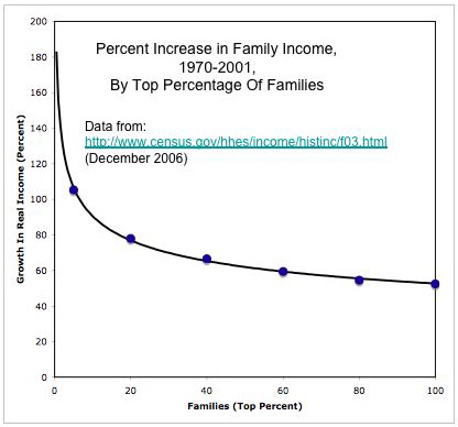
I could look for many references, other than Piketty and Saez, that draw the same basic picture. But I think I'll construct the staircase myself with some data from the U.S. Census Bureau. Figure 1 shows the staircase. Figure 2 shows the same data, analyzed a different way. It also shows a log-linear regression line, from which one can extrapolate how much the income of the top 1%, for example, has increased over the same period. If one wanted, one could fit a regression with each year. This would estimate a time series over the period.
Figure 1: Increase in Inequality Over 30 Year Span


Figure 2: Increase in Income In Top Percentiles

Sunday, July 09, 2006

Reversal Of Great Compression In Income Distribution In U.S.A.

I recently posted about income (im)mobility in the United States. One interested in that subject is probably also interested in the deteriorating (that is, increasingly unequal) distribution of wealth and income in the U.S. On the latter subject, my current favorite reference is a paper by Piketty and Saez, recently presented at the annual conference of the American Economic Association.

Piketty and Saez construct some time series from census data, tax data, and national income accounts. They use census data to find the total number of tax units in a country. A tax unit might be an individual, or it might be a household. Tax data is used to find top incomes and their decomposition by source. National income accounts and their predecessors are used to convert top incomes into shares. Piketty and Saez are sensitive to issues of tax evasion and avoidance.

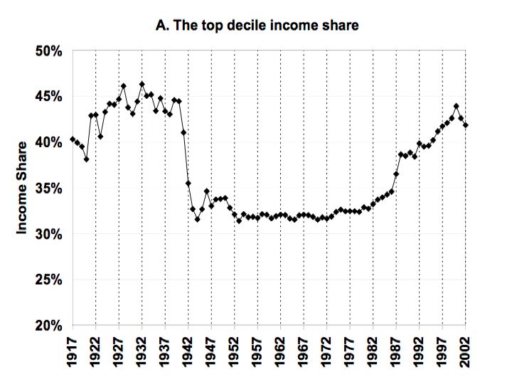
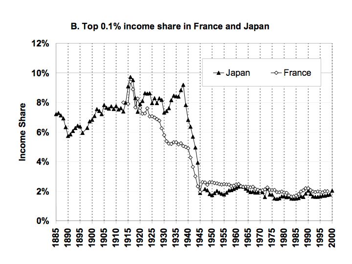
The figures below are selected results from Piketty and Saez. Rank tax units, each year for, say, the United States, by income obtained. For Figure 1, look at the upper 10% (a decile) of these tax units. The figure shows the trend in the percentage of income obtained by these tax units over almost a century. If income were distributed perfectly equal, the graph would show a straight line at 10% on the vertical axis. Since income is not equally distributed in the United States, the time series is above 10%. The graph starts at 20% to emphasize the observed fluctuations in the proportion of income obtained by the top decile. Notice that Figures 2 and 3 show international comparisons for the top one thousandth, not the top tenth.

Figure 1: Income Share Of Top Decile In United States


Figure 2: Income Share Of Top 0.1% In U.S.A., U.K., And Canada


Figure 3: Income Share Of Top 0.1% In Japan And France


Piketty and Saez show that what Claudia Goldin and Robert Margo name “the great compression” in income distribution has been reversed in the United States. It has not been reversed in Japan and France, though.

Since Piketty and Saez are exploring the upper end of income distribution, they do not document the contrast between the “picket fence” and “staircase” pattern in income distribution. Since this contrast is a basic fact about the United States, I summarize it here. As above, suppose all households or individuals are ranked by annual income for each year. Divide this population into five groups, that is, into quintiles. So the poorest fifth is the first quintile, and the richest fifth is the fifth quintile. Calculate the average (mean) income of each quintile for each year.

You will find that during the post (Second World) War “golden age” (extending roughly until sometime in the 1970s), the average income of all quintiles increased roughly at the same rate. When the increase of the average income by quintile is graphed versus quintile, one obtains a picket fence pattern. On the other hand, one obtains a staircase pattern during the last third of a century or so. The average income of the first quintile seems to have even fallen; middle quintiles increase their income only slightly; and the rich increase their income even more. In the golden age, all groups obtain some of the advantage of increasing productivity, while in current period the rich are able to increasingly monopolize gains in productivity.

Piketty and Saez show this staircase pattern extends dramatically into the upper limits. Those last few steps have grown bigger and bigger.

Reference
  • Piketty, Thomas and Emmanuel Saez (2006). "The Evolution of Top Incomes: A Historical and International Perspective", Proceedings of the American Economic Association (Jan.)